CLIENT: GOOSE POINT OYSTERS
Refreshing freshness.
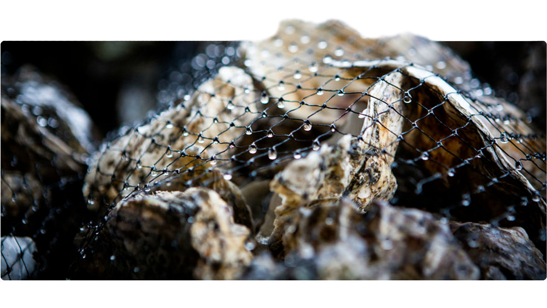
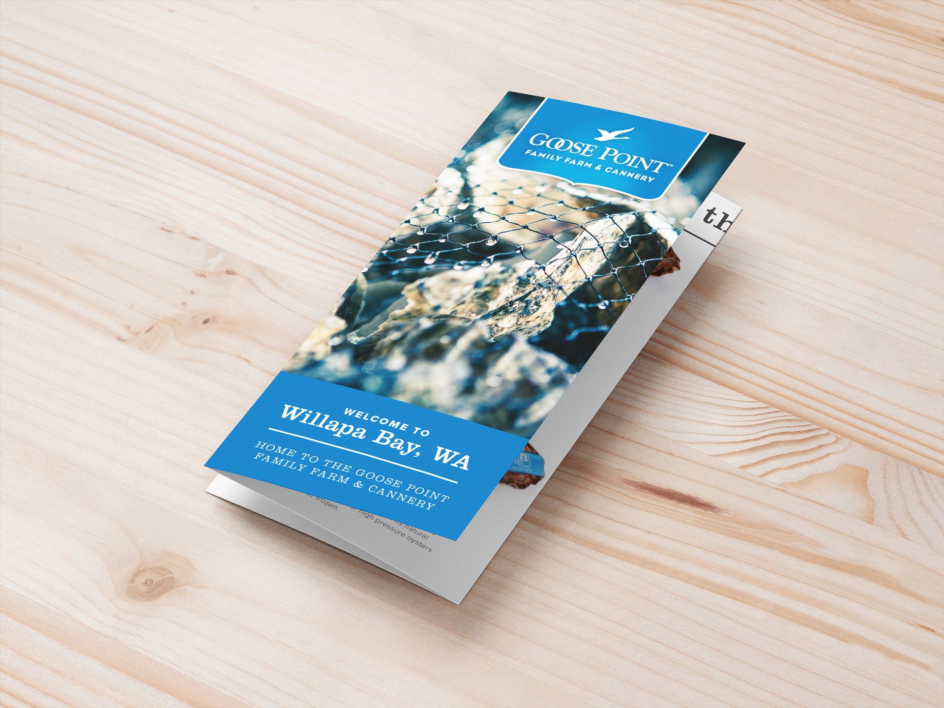
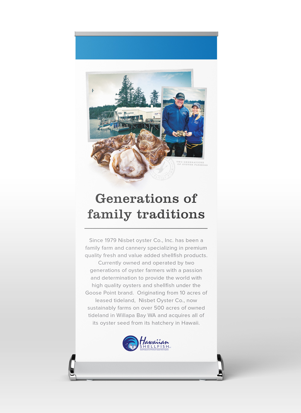
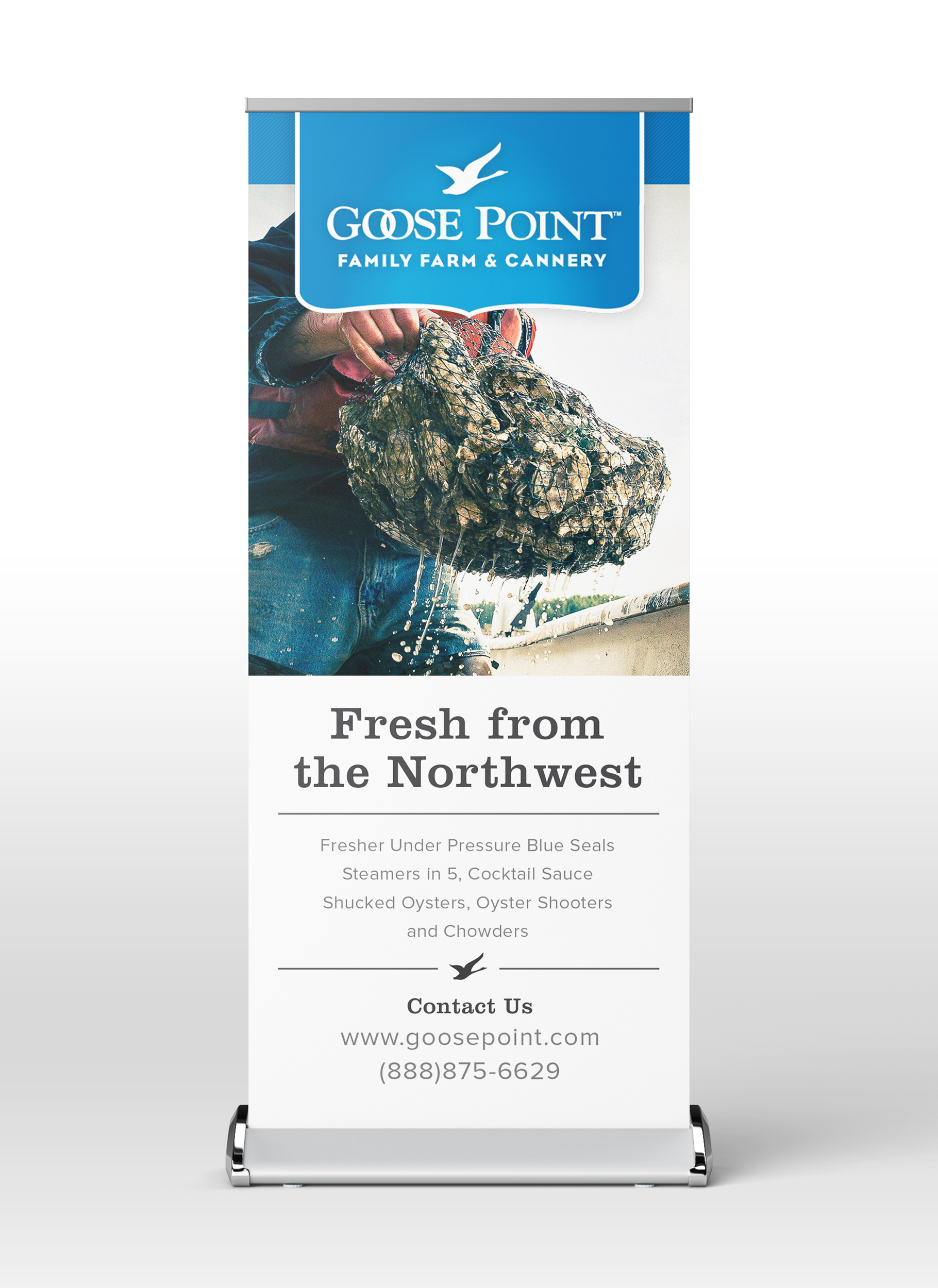
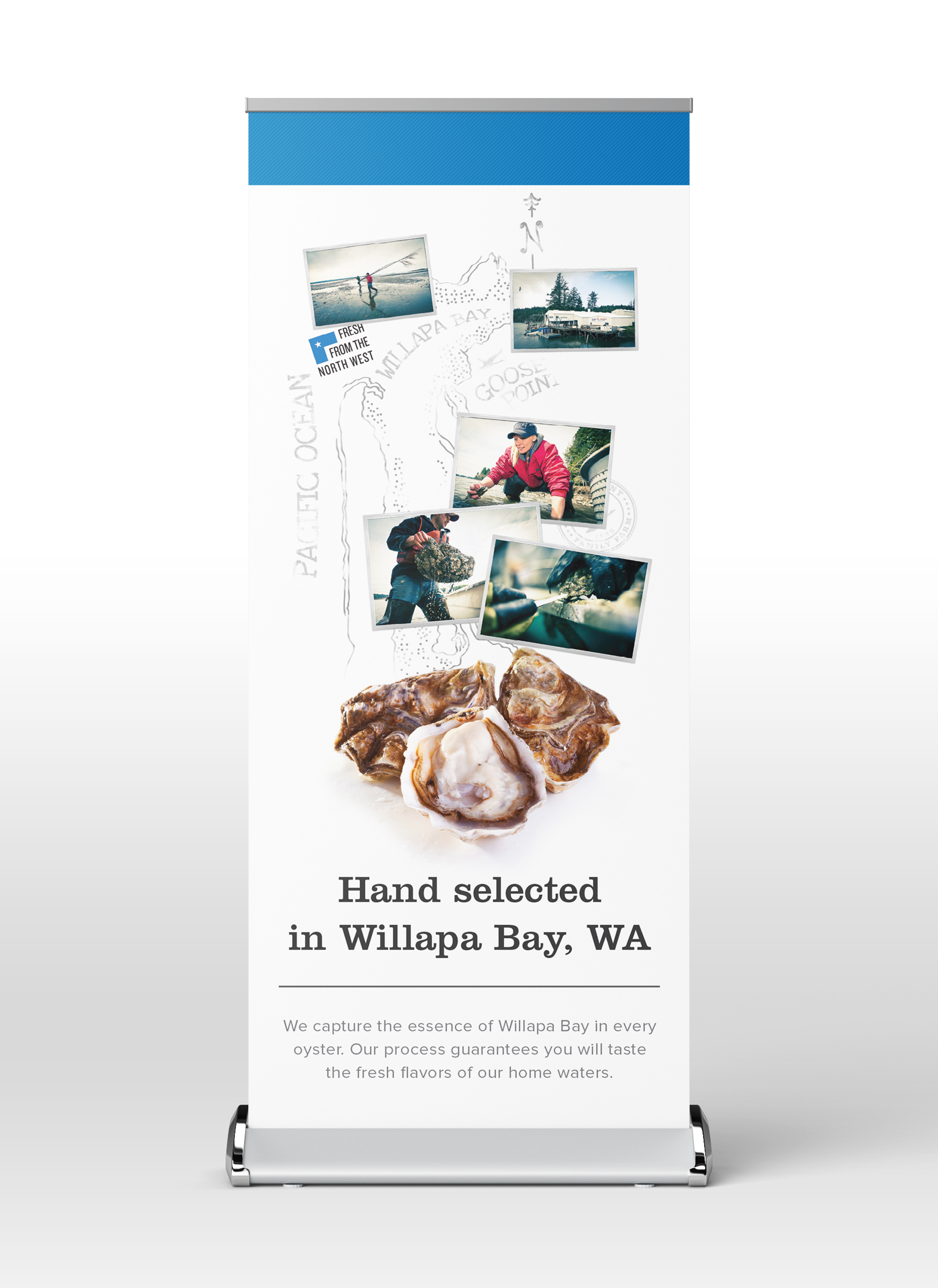
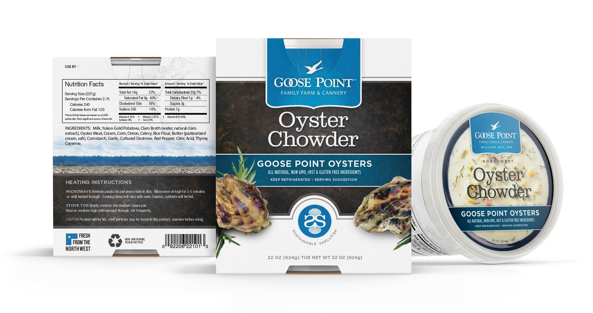
Goose Point Oysters, a revered family-owned and operated company renowned for their premium northwest fresh oysters, approached me with a project to revamp their dated brand, collateral, and website—an exciting opportunity to refresh a brand synonymous with some of the world's freshest oysters; however, as a non-oyster enthusiast, the only challenge arose when capturing enticing photos, but the remainder of the process flowed seamlessly, resulting in an updated look that authentically portrays the exceptional quality and freshness of their products.
BRAND STRATEGY
BRANDING
PRINT COLLATERAL
PACKAGE DESIGN
WEB DESIGN
PHOTOGRAPHY
WEB DESIGN
Fresh oysters, fresher web experience.
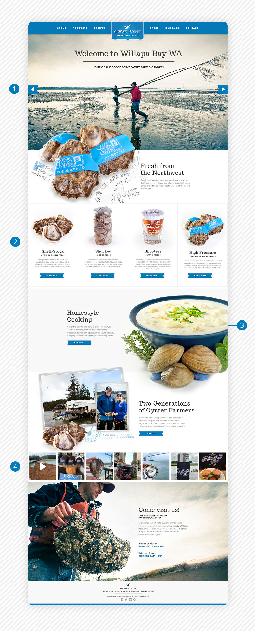
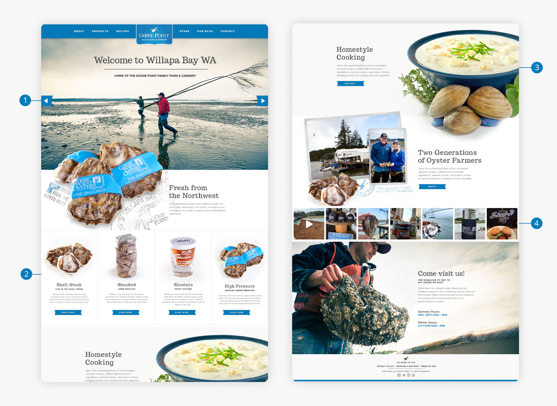
A modern and fresh web design for Goose Point Oysters captivates visitors with its sleek aesthetics and intuitive user experience, allowing them to explore our premium oysters and discover the essence of our brand effortlessly.
1
LARGE HERO SPACE FOR VISUALS
Our objective was to create a captivating virtual journey to Willapa Bay through our website, showcasing the breathtaking beauty of the Pacific Northwest, where some of the freshest oysters are cultivated. By immersing viewers in the stunning landscapes and highlighting the natural allure of the region, we aim to evoke a sense of wonder and appreciation for the origins of our exceptional oysters.
2
GET TO THE SALE FASTER
With the primary goal of driving product sales, we strategically positioned our select hero product prominently at the top of our homepage, minimizing the need for excessive scrolling or clicking. This deliberate placement ensures effortless access for visitors, maximizing convenience and enhancing the overall user experience.
3
LARGE IMAGERY
Our vision for the website was to create a visually striking impact by utilizing large hero images that exude a captivating 3D effect, immersing visitors in a dynamic experience where the imagery seemingly leaps off the screen. This design approach adds depth and dimension, making the site truly unforgettable.
4
SOCIAL FEED
By strategically incorporating a dynamic social feed on the homepage, we skillfully transport viewers to the captivating landscapes of Willapa Bay, fostering a deeper connection and igniting their interest in the Goose Point Oysters brand.

RESULTS
Since unveiling our refreshed brand, we have been overwhelmed with positive feedback from both our valued customers and esteemed wholesalers. They are enamored by the clean and modern aesthetic that seamlessly blends with a timeless quality, creating a visual identity that resonates with their sensibilities and captures their admiration.
TAKE AWAYS
Working on this project has been an immensely enjoyable experience, and it has truly enlightened me about the profound impact of the "less is more" concept. Through the strategic use of a reduced color palette and a simplistic design approach, we have achieved an ideal equilibrium between conveying the essence of premium freshness and establishing a timeless brand that resonates with our audience.

